

The crisis in taste and why AI might make it worse
The Taste Gap in AI Marketing - Part I.

Pull up the last 20 pieces of content your brand shipped.
Remove the logos. Strip the brand names. Put them in a folder. Now look at them honestly: Can you tell they’re from YOUR company—and not from your competitors or just some generic company in your industry?
If you hesitated—even for a second—your brand is dissolving. And AI is about to make it 10x worse.
We call this the taste gap. It’s the chasm between the ease of mass-producing bland, uniform content at scale on one side—and the difficulty of creating emotionally resonant, distinctive content that people actually remember on the other.
Since 2023, AI has multiplied creative output by 100x, making this problem no longer theoretical but existential. Every campaign looks the same. Every color is a gradient. Every brand has the same message. Every piece of content reads like it came from the same template.
It’s not that we, marketers, don’t have taste (although we could argue around that too, to be honest). It’s that performance marketing culture that has turned content production into an industrial process, optimized for volume over voice.
This series seeks answers on how to return to an era when campaigns were crafted like artifacts, brands were created like movements, and content creation was closer to art than sales.
Because with AI, we’re at a crossroads: flood the world with meaningless, bland, sterile slop—or generate the most beautiful things marketing and advertising have ever created—your choice.
But first, you need to understand what we lost.
What is taste, anyway?
Before we diagnose the crisis, let’s clarify what we mean by “taste.” Because it’s not what most people think.
Taste is NOT:
Following design trends
Knowing what’s “on brand”
Having strong opinions about fonts
Liking expensive things
Being a snob about aesthetics
Taste IS:
The ability to discern quality from mediocrity—and articulate why
Understanding how craft creates emotion—why certain typography feels premium, why certain color combinations create tension, why certain copy rhythms land
Having a point of view—knowing what you are, and more importantly, what you’re not
Knowing what to say no to—taste is as much about restraint as it is about execution
Let’s make this concrete with examples you can see right now:
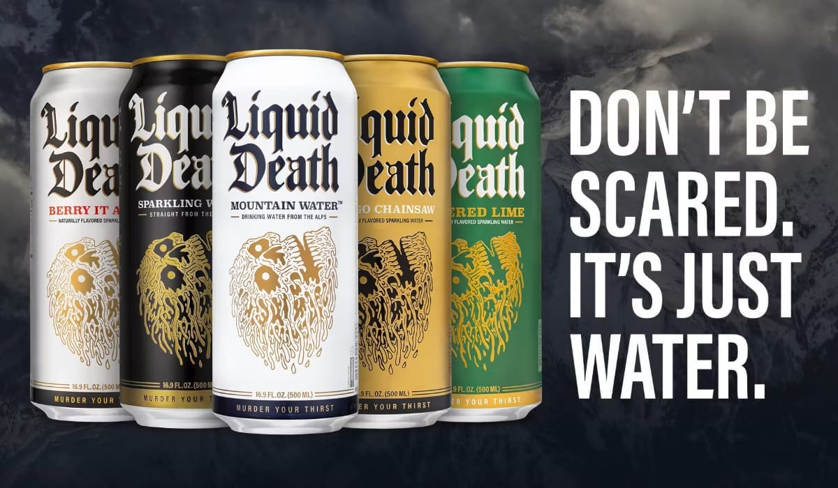
Why does Liquid Death’s skull logo work when 1,000 other skull logos feel cheesy? Google “skull logo.” You’ll find thousands. Most feel like cheap gas-station t-shirts. Liquid Death doesn’t. Why?
Because it’s executed with craft. The line weight is consistent—no awkward thick-to-thin transitions that scream “I used auto-trace in Illustrator.” The style references punk rock album covers and heavy metal aesthetics with precision, not approximation. It’s not trying to be “edgy skull logo but also corporate-friendly.” It commits fully to the bit.
Look closer: clean vectors, proper negative space, scalable across sizes from a can to a billboard without losing clarity. The typography pairing is equally committed—bold, condensed, aggressive. Nothing soft. Nothing hedged. But more importantly, it signals a brand that knows exactly what it is. Death metal aesthetic for water. Not death metal-lite. Not death metal with safety rails for Target. Just full commitment to an aesthetic that shouldn’t work for bottled water—but does, precisely because of that commitment. That’s taste: craft, point of view, and commitment.
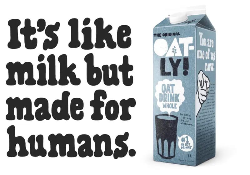
Why does Oatly’s weird copy feel charming when other brands’ weird copy feels try-hard? “It’s like milk but made for humans.” That line shouldn’t work. It’s weird. It’s slightly insulting to dairy farmers. It’s not “safe” corporate copy. But it’s pure Oatly—Swedish directness meets cheeky environmentalism. Their packaging has paragraph-length manifestos in 8pt type. Their taglines are conversational and sometimes absurd: “Wow, no cow!” Their tone never breaks: always self-aware, never corporate, occasionally ridiculous.
Bad “quirky” copy tries to be weird while still playing it safe. It adds an emoji or a “hey there!” but keeps all the corporate hedging: “Our innovative solution leverages cutting-edge technology to empower teams! 🚀” Oatly chose a lane—conversational, slightly absurd, environmentally conscious without being preachy—and stayed in it consistently for years. On packaging. In ads. In press releases. Even in their financial filings. That consistency is what makes it charming, rather than annoying. That’s taste: commitment to voice.
The vocabulary of taste
Here’s the problem: most marketers can’t talk about creative work beyond “I like it” or “it’s on-brand.” That’s not enough. Taste requires vocabulary to discuss and evaluate creative work. Learn these five dimensions:
Tension vs. Harmony
Does this create visual or emotional friction (interesting, memorable) or does it flow smoothly (comfortable, forgettable)?
Luxury brands use tension: unexpected color pairings, asymmetric layouts, and copy that challenges you.
Mass brands use harmony: everything flows, nothing jars, nothing sticks in your memory.
The best work uses both: harmony in the overall system, tension in specific moments. Apple’s minimalism (harmony) with bold product reveals (tension).
Restraint vs. Excess
Is this doing one thing beautifully or many things adequately? Hermès uses two colors and one typeface across its entire brand. That’s restraint.
Walk into a grocery store—every package screams 47 different messages because the brand doesn’t trust any single one to work. That’s excess born of insecurity.
Restraint signals confidence. Excess signals panic.
Craft vs. Production
Was this made with care or manufactured at scale? You can feel the difference.
Hand-drawn illustrations vs. stock vectors. Carefully written copy vs. template fill-in-the-blanks. Custom photography vs. stock images. Bespoke interactions vs. Bootstrap components.
Craft takes time. Production optimizes it away. Your audience can tell which one you chose.
Resonance vs. Engagement
Does this create lasting memory or just momentary interaction
Engagement is a click, a like, a view. It appears on your dashboard.
Resonance is remembering the ad five years later. It appears in culture. “Think Different” had resonance. You remember it 27 years later.
Your last five Facebook ads had engagement. You don’t remember any of them.
Signal vs. Noise
Is this clear and distinctive, or cluttered and generic?
Signal is a single strong idea executed clearly.
Noise is trying to communicate everything at once and ends up communicating nothing.
Most brands create noise because they’re afraid of choosing.
Signal requires the confidence to say one thing and trust it’s enough.
When you can articulate these dimensions, you’ve moved from opinion (”I like it”) to judgment (”This works because it uses restraint to create tension, which makes the single moment of carefully planned excess hit harder”).
That’s the vocabulary of taste. Now let’s talk about how we lost it.