

How to Train Your Taste Using AI
A Taste Gap In AI Marketing - Part II

In Part 1, we diagnosed the crisis: the taste gap is widening, AI is accelerating mediocrity, and most marketers were systematically trained to ignore aesthetic judgment. You took the 60-second test. You saw where your brand stands. You chose Option 3.
Now comes the hard part: actually developing taste. Not reading about it. Not agreeing that it matters. Not forwarding this to your team with a “thoughts?” Actually doing the work. This is the 90-day transformation that helped CMOs go from “I know what I like“ to “I know what works and can articulate why with precision.“
It’s not a theory. It’s a daily practice. And it uses AI not as your replacement, but as your training partner. Let’s begin.
The foundation: Why taste is trainable (and why you were told it isn’t)
Before we get into the program, let’s kill a myth that’s probably sitting in the back of your mind: “Some people are just naturally creative. I’m not one of them.“
Bullshit. Taste isn’t a mystical gift bestowed upon the chosen few who went to art school or grew up in Milan. It’s pattern recognition, vocabulary, exposure, and practice.
You already have taste in other domains—you just don’t call it that.
You can walk into a restaurant and immediately know if it’s trying too hard.
You can spot a fake Rolex from across the room.
You can tell within 30 seconds if a movie is going to be good based on the opening shot.
You can sense when someone’s LinkedIn post is authentic versus when they hired a ghostwriter who doesn’t quite have their voice.
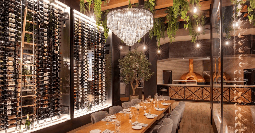
Pizza oven + extreme long wine list = probably a good restaurant
That’s taste. You’re exercising aesthetic judgment constantly. You just haven’t formalized it. You haven’t built the vocabulary to articulate what you’re seeing.
And you definitely haven’t applied it systematically to your marketing. The reason you think you don’t have taste is that the system trained you not to trust it.
“Don’t bring me opinions, bring me data.“
“What does the test say?“
“That’s too subjective.“
“How do we know it’ll work?“
For decades, you’ve been rewarded for suppressing aesthetic judgment and optimizing for metrics. Your taste didn’t disappear. It just atrophied from disuse. But hey, muscles rebuild faster the second time.
How the 90-day transformation works
Is this a course? No. This isn’t a course. It’s more like a systematic practice regimen. Think of it like learning a language through immersion, not through memorizing grammar rules. You’re not going to study taste—you’re going to practice seeing.
The program has four core practices:
The Deconstruction Practice (15 min/day) - You learn to see craft by reverse-engineering great work
The Comparison Method (10 min/day) - You build discernment by analyzing quality gaps
The Reference Collection (10 min/week) - You define YOUR aesthetic point of view
The Application Sprint (2 hours/week) - You test your taste on real work
Total time investment: 30 minutes per weekday + 2 hours on weekends = 4.5 hours per week.
That’s it. That’s the commitment. Maybe a lot? Maybe yes, but you probably doom scroll more on your phone in a week. And this is only for 90 days. Think of it as a self-development sprint.
In 90 days, your eye will change. You’ll see things you couldn’t see before. You’ll articulate judgments you couldn’t articulate before. And most importantly, you’ll know what to say yes to—and what to kill.
Now let’s break down each practice.
Practice 1: The Deconstruction Practice (Days 1-30)
What you’re training
The ability to see craft, not just content. Most marketers look at a piece of content and think “I like it“ or “I don’t like it.“ That’s not taste, that’s preference.
Taste is the ability to see why something works. To identify the specific craft decisions that create the emotional response. The Deconstruction Practice trains you to see craft by reverse-engineering great work.
How it works
Every morning for 30 days, you deconstruct one piece of exceptional work. Not good work. Not “this performed well“ work. Exceptional work. The kind that makes you stop scrolling. The kind you remember three years later.
Set a timer for 15 minutes. Pick a piece. And answer these questions using AI as your sparring partner.
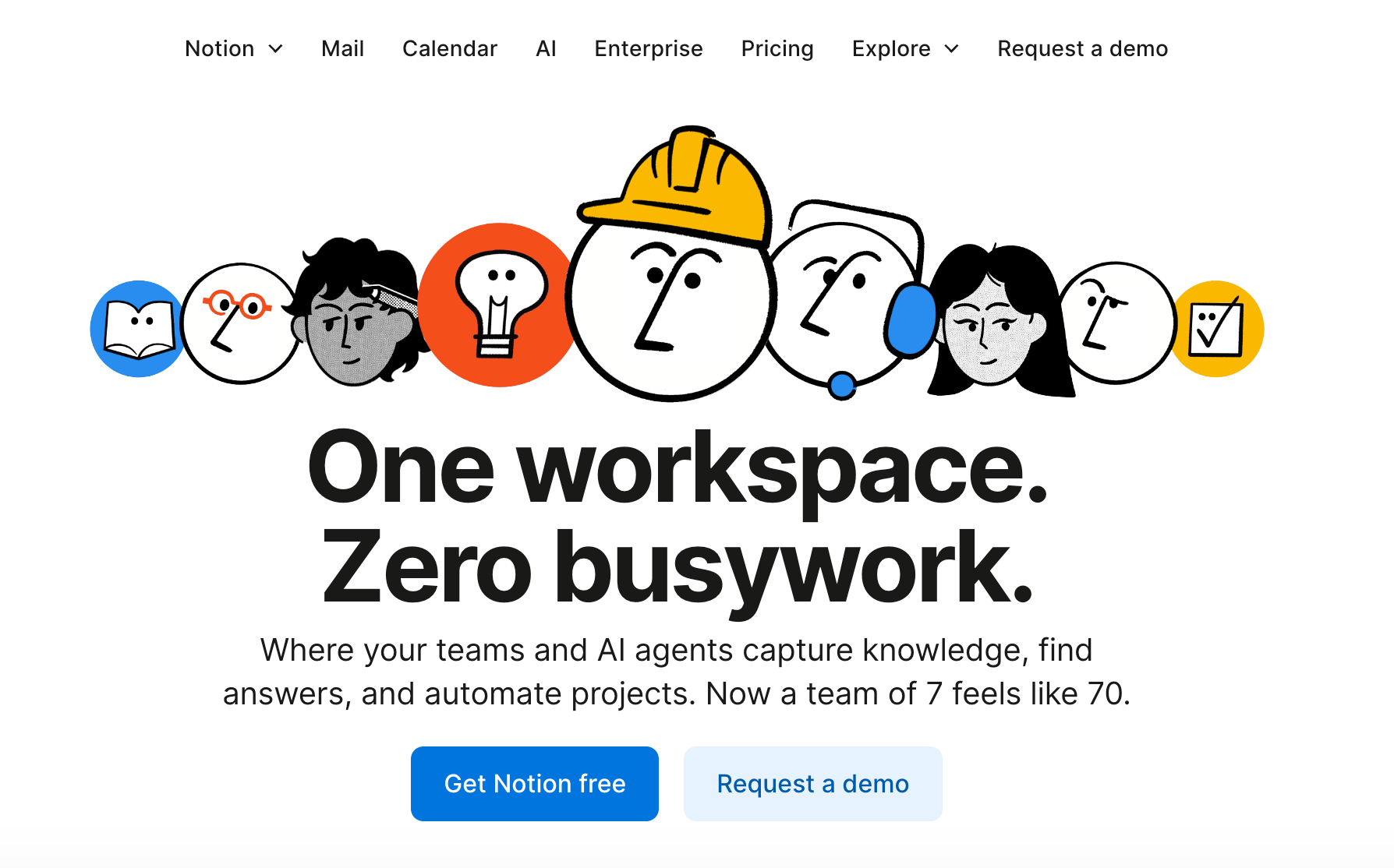
Notion’s home page is a good example of exceptional positioning and messaging
Copy/Messaging:
What’s the first sentence doing? (Hook, context, tension, promise?)
Where does the rhythm change? (Short sentence after long ones, one-word sentences, repetition?)
What’s the reading level? (Sophistication vs. accessibility?)
What words carry the emotional weight? (Verbs, adjectives, specificity?)
What’s not being said? (Restraint, what they left out?)
Visual:
What’s the first thing your eye sees? (Hierarchy, contrast, scale?)
What’s the second thing? (Intentional eye path or chaos?)
What’s the typographic decision? (Font choice, weight, spacing, alignment?)
What’s the color doing? (Emotion, contrast, harmony, tension?)
What’s the white space doing? (Breathing room, premium feel, focus?)
Structure:
How does it start? (Direct, narrative, provocation, question?)
How does the middle build? (Tension arc, examples, logical progression?)
How does it end? (CTA, reflection, cliffhanger, emotional peak?)
Point of View:
What does this say about the brand? (Identity, values, taste?)
What is this NOT? (What aesthetic did they reject?)
Who is this for? (And equally important: who is it not for?)
Your AI prompt for daily deconstruction:
I'm training my taste by deconstructing exceptional marketing work.

Here's the piece I'm analyzing: [paste content or describe visual]

Help me reverse-engineer the craft decisions:

1. COPY ANALYSIS:
   - Identify the hook mechanism in the first sentence
   - Map the rhythm changes (where does pacing shift and why?)
   - Highlight the 5 words carrying the most emotional weight
   - Point out what's deliberately NOT being said

2. VISUAL ANALYSIS (if applicable):
   - Describe the intentional eye path (1st, 2nd, 3rd thing you see)
   - Identify the typographic hierarchy and why it works
   - Analyze the color choice (emotional intention)
   - Explain what the white space is accomplishing

3. STRUCTURAL ANALYSIS:
   - How does the opening create tension or curiosity?
   - How does the middle maintain momentum?
   - What makes the ending memorable?

4. AESTHETIC JUDGMENT:
   - What is this brand committing to? (Their taste position)
   - What aesthetic did they explicitly reject?
   - What audience does this alienate (by design)?

Don't just describe what's there. Tell me WHY these specific choices work together to create the effect.

I want to learn to see craft, not just content.
What to deconstruct:
Week 1-2: Email campaigns
Find exceptional welcome emails, launch emails, storytelling newsletters. Brands to study: Morning Brew, Milk Road, Stratechery.
Week 3-4: Landing pages
Study conversion pages that don’t feel like conversion pages. Brands to study: Stripe, Linear, Notion, Superhuman.
Week 5: Long-form content
Essays, thought leadership, manifestos. Study: Paul Graham essays, Stratechery, Wait But Why, Aeon.
Week 6: Social/Short-form
LinkedIn posts, Twitter threads, IG carousels that break through the noise. Study: Wes Kao, Lenny Rachitsky, Anthony Pompliano.
The critical insight: After 30 days of deconstruction, you’ll start seeing patterns. You’ll notice that great work always has intentional restraint. That emotional weight comes from specificity, not adjectives. That rhythm changes signal transitions. That white space isn’t “empty”—it’s doing work.
You won’t be able to unsee it. Every piece of content you encounter will reveal its craft decisions to you. That’s when you know your eye is changing.